Feature prioritization
Design System
Native app design


Quick overview of final feature set
Something was wrong with Kajabi's mobile strategy
The product team had already sunk time into building a mobile app for content creation—a risky move in terms of time and resources. Leadership let us know they no longer wanted to pursue the project.
I stepped in with a better plan: pivot to an admin app, a feature our users had been begging for and something Kajabi had never offered.
My focus? Deliver an MVP with just the essentials for a quick, high-impact win. I was laser-focused on shipping something users would actually use—and love. I owned all product design + created a mobile design system. I also owned user research, and much of the feature prioritization.

I got some clear signals about feature prioritization
User research helped me run a survey which gave us some clear signals in which direction to go. I knew what I wanted to ask, and the researcher helped me find a relevant set of customers. We used MaxDiff methodology which helped me come up with a matrix of desired features.
Customers wanted to understand how many sales they made today, if they got any new subscribers, and clear notifications in case of any fires.
I zeroed in on analytics and payment notifications—letting creators get that dopamine rush when a course sells.
We also added alerts for failed payments and refunds, so creators know exactly when they need to jump in and manage a client issue.

Scores sum to 100 across MaxDiff items and are ratio scaled, meaning that an item with a score of 10 is twice as preferred (or important) as an item with a score of 5.
Given a tight deadline, I quickly honed in on the simplest path forward
Using the results from the survey, I plotted out which features we could get to market the fastest vs. desirability. I owned creating this first draft of features, with engineering weighing in on feasibility.
Features in the MOST DESIRED v. LOW ENG EFFORT are of course no-brainers.
Highlighted are other possible feature areas in the "less sweet spot"


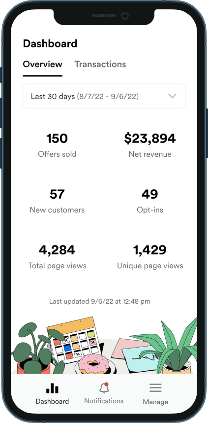
Selection of screens from final release
We made some ruthless scope cuts to maximize time to market
I modified my prototype in light of the new insights.
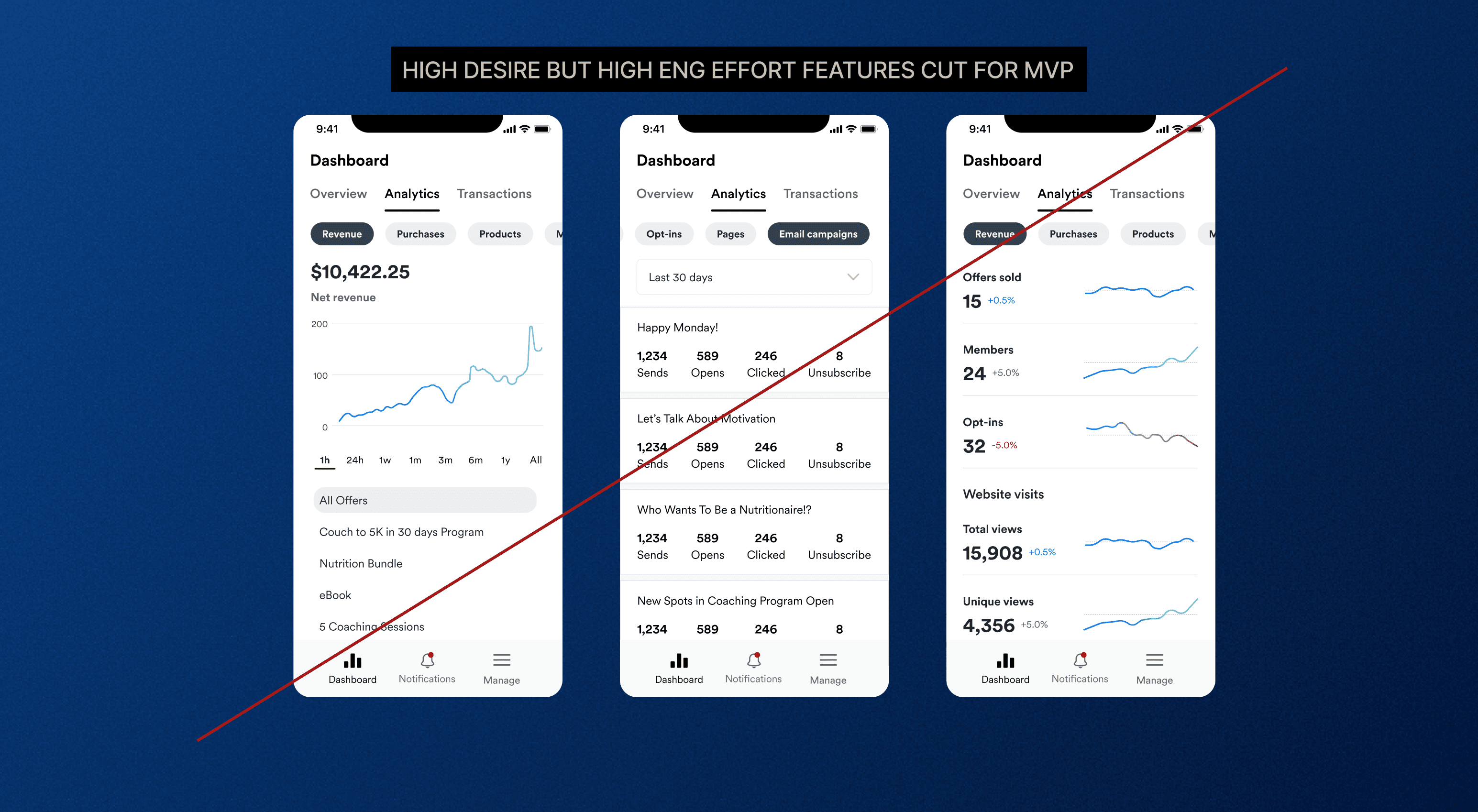
Advanced analytics, CRM tools, and marketing stats were pushed to V2 due to the data being more difficult to access out of the box and a heavier front end required to represent the data appropriately.

Advanced analytics screens cut from initial release

Detail of cut analytics screen
The MVP bet on notifications and quick stats
Within a few months, with zero advertising, the app hit 10K downloads.
After a year, downloads were
25K iOS
5K Android
With around 60K active subscribers, that means nearly half of our customers downloaded an app that’s basically just notifications and key stats
We knew this was a lightweight MVP from the start. The next steps were clear: expand analytics to match the desktop experience and add features like checking and drafting marketing emails.


Selection of branded screens

Selection of dark mode screens
Let's doooooo it
I'm looking for teams with AI-fluent workflows and products
where AI is core to the experience, not a checkbox.


